
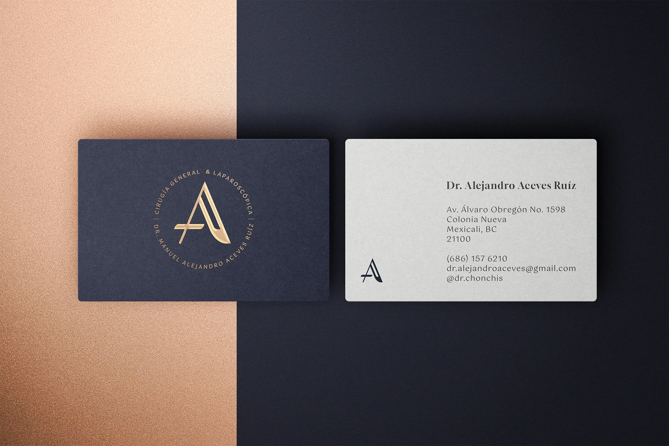
Dr. Alejandro Aceves
*
Dr. Alejandro Aceves *
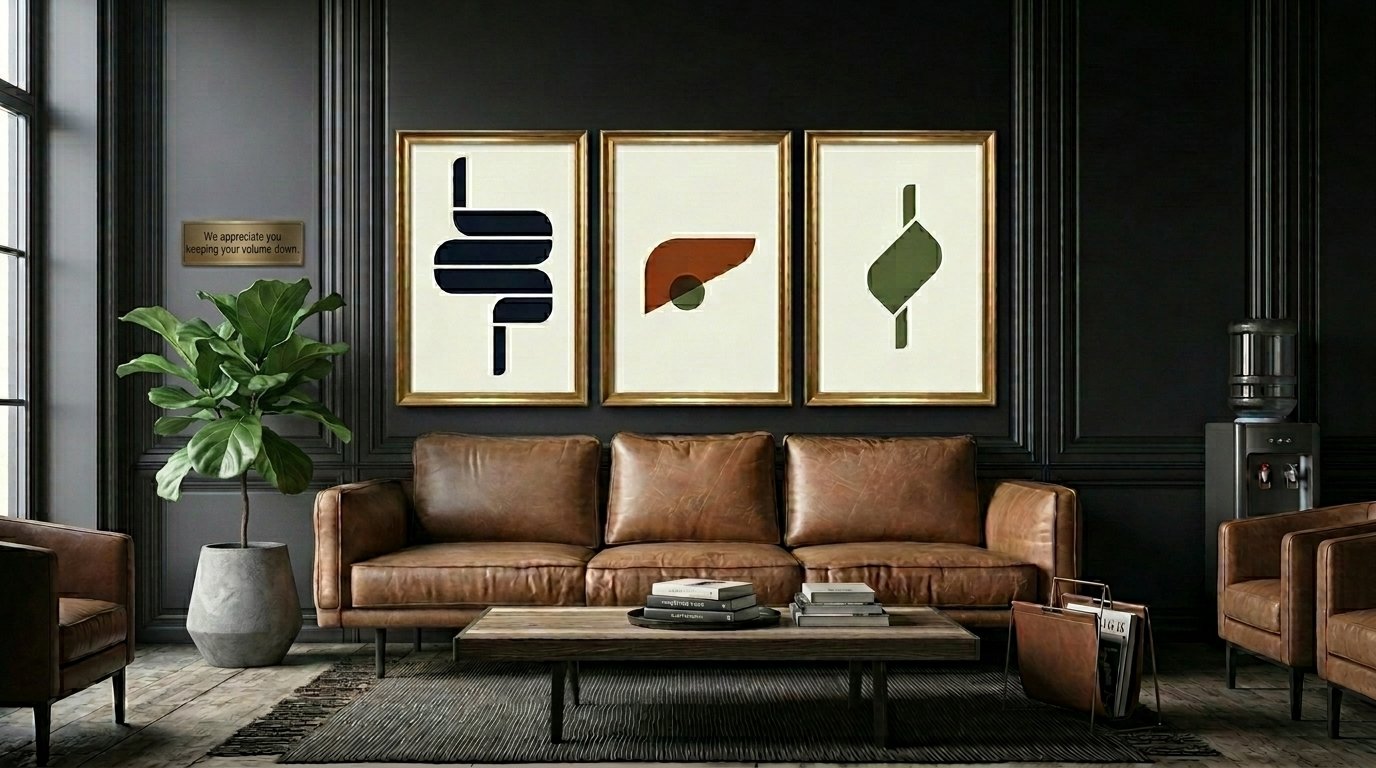
We can’t think of anything more important than choosing whose hands we put our health in. That is why we approached this surgeon’s branding in a way that conveyed experience and reliability. The logo features a letter A discreetly formed by a scalpel and a warm and rich color palette, which aims to be inviting for patients, paired with dainty typographies that mimic the meticulousness of the industry. For imagery style we went with a more modern style, creating organs from simple modern shapes.

Role
Creative Direction & Design
Year
2025
Get to know him!
www.cirujanoalejandroaceves.com